Abstract: Arthur Lupia’s 1994 “Shortcuts Versus Encyclopedias” presents optimistic results suggesting that low-information electors behave remarkably similar to high-information electors at the ballot box. Here I celebrate the 25th anniversary of this seminal article’s publishing by revisiting its central themes using Lupia’s original data. Below I identify and discuss two issues with the original article: 1) the survey’s knowledge battery does not measure the type of knowledge that should be established as the normative standard for informed voting; 2) the knowledge scale construction rewards nonresponses with higher scores, despite their observation equivalence to uncertainty and, are a result, distorts respondents’ true knowledge score. Correcting for the second issue, the general patterns Lupia’s central findings hold, though not nearly to such an extreme degree as presented in the original article.
Introduction
Arthur Lupia’s 1994 “Shortcuts Versus Encyclopedias” came in response to the resurgence of an inherently elitist question: “Can the ignorant, passionate masses be trusted with a thing as precious as Democracy?” This question is as old as Democracy itself (see e.g. Thucydides’s History of the Peloponnesian Wars 3.11-3.50) and its motivating fear was integral to the construction of American political institutions (e.g. Federalist Paper 49). This question has persisted, in part, due to lexically diverging priorities of scholars on either side of the issue. For some, Democracy cannot function without a fully informed public; for others, information is a secondary consideration to the respect for an individual’s right of self-determination. The genius of Lupia’s article is its appeal to both rationalists and idealists: uninformed electors can behave as if they were fully informed so long as they hold accurate information shortcuts. Namely, knowledge of which propositions political figures and interest groups support.
Despite the merits of its aim toward overlapping consensus on this pervasive question, the original study is not without faults. First, its survey construction was imperfect: the knowledge battery tapped into merely superficial knowledge, which does little to inform researchers of electors’ beliefs regarding the implications of various policy alternatives. Lupia compares the voting behaviors of electors belonging to three arbitrarily constructed groups (high knowledge with information shortcuts, low information with information shortcuts, and low information with no information shortcuts) and finds the first two groups’ voting behavior to be remarkably similar. Given that the knowledge categories are (a) arbitrary and (b) measuring superficial knowledge, I would be reluctant to make between-group comparisons as if they were analogous to comparisons between the rationalists’ ideal and the uninformed.
Second, and relatedly, the construction of the knowledge scale gives a dishonest representation of respondents’ true (albeit superficial) knowledge. The scale mistakenly conflates non-responses (i.e. no answer) with affirmative responses in the negative (i.e. an explicit “no”) and thereby introduces uncertainty into the scale. A non-response, which is observationally equivalent to an explicit “no” in the survey construction, is rewarded with higher knowledge scores; this effectively makes electors who gave unclear responses appear more similar to respondents with high knowledge scores. Lupia thereby put his thumb on the scale in favor of making low- and high-knowledge respondents appear more similar than they are in reality.
All said, the general patterns in the findings of the original article hold, though not to such an extreme degree as Lupia presented them. By making slight modifications to the construction of the knowledge scale, I find that those who have relatively low knowledge but accurate information shortcuts behave more similarly to the high knowledge group than other groups. These patterns hold across multiple arbitrary cutpoints of the new knowledge scale. While the effect of information shortcuts has been taken up by many other scholars since 1994, I return to Lupia’s original article to celebrate its 25th year anniversary; I plan to celebrate this seminal piece by dissecting it ruthlessly and reexamine is persuasive merits. This post also serves as a warning to fledgling political scientists to be wary of the construction of scales, both in your own work and in the articles you are assigned to read in every course about public opinion (e.g. Lupia 1994).
Political Context of Lupia (1994)
In 1988, California electors were presented with five propositions establishing policies related to their automobile insurance rates. No proposition was aligned with the two major political parties at the time, making it an ideal opportunity to study the effect of knowledge and shortcuts on direct-election outcomes without the interfering influence of partisan tribalism. Table 1 below illustrates the four major intended policy outcomes for each of the five propositions:
Table 1: Intended Policy Outcomes by 1988 CA Referenda
|
policy
|
prop100
|
prop101
|
prop103
|
prop104
|
prop106
|
|
No Fault Auto Insurance
|
No
|
No
|
No
|
Yes
|
No
|
|
Discounts for Good Drivers
|
Yes
|
No
|
Yes
|
No
|
No
|
|
Limits Attorney Contingency Fees
|
No
|
Yes
|
No
|
Yes
|
Yes
|
|
Prohibits Red Lining
|
No
|
No
|
Yes
|
No
|
No
|
Interest groups, policy stakeholders, and some political figures had an interest in the outcome of these propositions. No interest group spent more campaign dollars to inflence outcome of the referenda than the insurance industry, which spent more than $65 million, followed by trial lawyers ($15 million), and consumer activists ($2 million). As Lupia (1994) highlights, the insurance industry funneled campaign dollars to political organizations that appeared on the surface to be pro-consumer (66); as a result, the political information context was one of complexity and obfuscation. Do keep this point in mind, as it is integral to correctly understanding Lupia’s results.
Survey and Measurements
Lupia constructed the knowledge scale from four survey items following the general pattern:
Which of the following proposition(s) would enact policy X?
As mentioned above, one of my primary motivations here is to present the data more honestly by addressing an issue of problematic scale construction. The knowledge scale is constructed in the following way: respondents are awarded knowledge points for answering survey items correctly in the affirmative; additionally, a respondent who gives no response (and does not indicate that she does not know) receives knowledge points for each “No” in Table 1. Respondents who incorrectly answer in the affirmative or give no response to correct answers are awarded no knowledge points for those cells. A respondent who admits ignorance by selecting “Don’t Know” is awarded no points for that row.
To fully illustrate how this scale is constructed, consider the following illustration:
Item 1: Among the following, please select those who are currently (2019) serving as United States Senators from Nevada. You may choose as many or as few response options as you please:
a. Dean Heller
b. Jacky Rosen
c. Brian Sandoval
d. Harry Reid
e. Dina Titus
f. Don’t know
If you selected response “b”, you would be awarded five knowledge points under Lupia’s construction: one for correctly identifying Nevada’s current senator and four for correctly NOT selecting any of the other response options. Great work. You would belong in the “high knowledge” category if the study were related Nevada politics.
If you selected one of the incorrect options (“a”, “c”, “d”, or “e”) and no other choice, you would be awarded three knowledge points: each for correctly NOT selecting one of the other incorrect options. Keep this up and you will be safely in the “high knowledge” category with all the other experts of Nevada politics.
Imagine you selected “b” but you were uncertain about the other US Senator from Nevada: in one scenario, you might leave the remainder of the options blank and be awarded five knowledge points and assigned to the “high knowledge” category. In an alternative scenario, you might have acknowledged your uncertainty and supplemented your “b” response by selecting “f”: in this case, you would be assigned only one knowledge point and relegated to the low information category.
In following these rules, we have constructed our knowledge score distribution. Keep in mind that the cut point of knowledge = 10 was arbitrarily assigned, though the final results are somewhat resilient to changes in the arbitrary cutoff point. This point will be discussed in greater detail below.
Fig. 1: Distribution of Original Knowledge Score 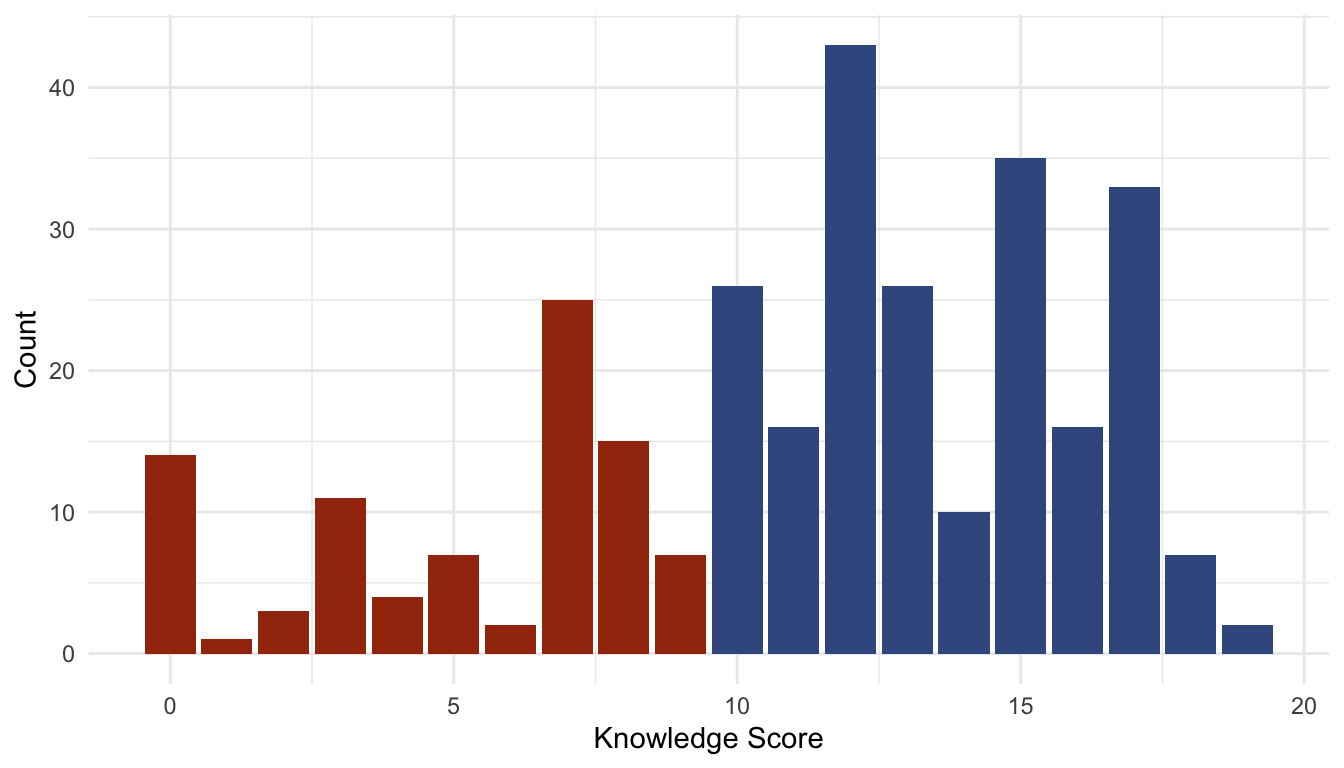
The color of the bars in the distribution above highlight the knowledge category to which respondents were placed for the final analysis. Blue indicates the high knowledge group while red indicates the low knowledge group.
As a final consideration, imagine you regret ever agreeing to participate in this survey. Imagine that you decide to give no response at all. Imagine that the unfortunate graduate student entering data accidentally glazed over your response and did not mark that row of your survey as incomplete. If this were to happen, you would be awarded four knowledge points and placed into the high knowledge bin.
That’s a lot to imagine, and it’s a little far-fetched, isn’t it? Well, roughly 3% of respondents in the final analysis match this description: no response was given on one or more rows and the respondent was given knowledge points for nonresponses to the incorrect selections. As a result, these respondents were assigned to the incorrect knowledge category. In the most extreme (and most unlikely) hypothetical case, a respondent might have answered no questions at all and been awarded 13 knowledge points. Granted, 3% of the final analysis is likely negligible, and this clerical error that can be easily remedied However, it begs the question: how many respondents in the “high knowledge” category (10 or higher) actually belong there?
Here we have come face-to-face with the problem of observational equivalence between a non-response and an affirmative response in the negative, which is a byproduct of Lupia’s survey and scale construction. This problem can be mitigated by remaining agnostic toward nonresponses and punishing incorrect belief with negative knowledge points, as I will discuss in greater detail below. First, however, I must address a second issue that was overlooked in the original analysis: random guessing.
Guess Away
Given the structure of the survey battery (four rows, five options each), the total number of correct responses (7 affirmative, 13 non-response), and the rules governing the construction of the scale, respondents could perform quite well by guessing randomly. In Figure 1, we see one standard deviation above and below the mean knowledge score aggregated at the number of affirmative responses given. Figure 1-A (left) compares the observed knowledge scores* (red) against simulated random guessing (blue) while Figure 1-B (right) compares the observed knowledge scores against simulated pseudo-random guessing (blue).
The pseudo-random guessing simulation trims a number of random responses under an assumption of reasonableness: no reasonable respondent will genuinely believe that a single proposition aims to enact all four policy preferences. This would be similar to a series of four questions like Item 1 above on the Senators representing California, Nevada, Washington, and Oregon. No reasonable respondent will observe the survey structure and decide to respond in the affirmative to all of the response options for the Nevada survey item. Further, if a human were to guess randomly to the knowledge battery, that human would most likely make one guess per survey item. This is supported by the data, considering that the plurality of respondents made four responses in the affirmative (one per survey item).
Fig. 2: Observed Knowledge and Random Guessing
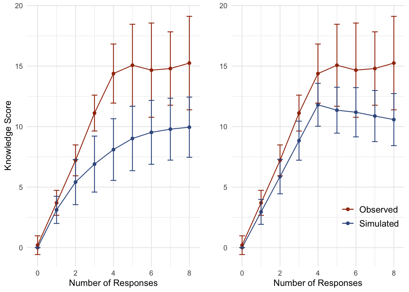
Figure 2 compares observed knowledge scores against simulated knowledge scores with random guessing (left) and psuedo-random guessing (right). The pseudo-random data is the randomly simulated data, trimmed of absurd and unrealistic response combinations (e.g. believing that one policy establishes all of the policy alternatives while the rest do establish none of them).
As the Figure 2-A (left) illustrates, the observed knowledge score is only slightly distinct from random guessing and hardly distinct at all from pseudo-random guessing. More importantly, nearly half of the random observations would be classified as “high knowledge” (48.4%), as well as a majority of pseudo-random observations (55.7%), compared to the observed (70.6%). In short, the vast majority of the “high knowledge” respondents performed about as well as random and pseudo-random guessers. I return to this point after first introducing the adjustment to knowledge scale construction.
New Knowledge Construction
The problem of observational equivalence can be addressed (i.e. ignored) here by remaining agnostic as to how to interpret non-responses. That is, assign points only to affirmative answers and do nothing with the rest. In the construction below, correct responses are awarded 1 knowledge point while incorrect responses are deducted 1 knowledge point.
This alteration to the construction of the knowledge scale may seem trivial; on the contrary, the results of the final analysis differ quite drastically (upwards of an 8% difference) and the new scale construction comes with a number of additional benefits (e.g. distinction from random guessing, resilence to arbitrary bin selection cutoff). Not least among the benefits is how the scale better-comports with normatively desirable epistemological traits: i.e., true belief is preferable to ignorance, which is preferrable to false belief. Under the original construction, respondents who admitted ignorance were given lower knowledge scores than those who guessed randomly or held incorrect beliefs. Respondents can be more appropriately assigned to knowledge categories by researchers remaining agnostic about whether a blank response is a “no” or an “I don’t know” and by measuring knowledge strictly by affirmative responses instead (moreover, researchers can improve their survey design by asking respondents for affirmative responses: e.g. “Did Nader support Proposition 103, yes or no?”).
Scale Performance Comparison
Figure 3 below illustrates various differences between the original and new knowledge scale construction. The first row of plots indicates that, a small number of outliers aside, the new scale has an approximately normal distribution. The relationship between pseudo-random guessing and the number of knowledge points awarded has drastically shifted under the new construction: on the left, the observed original knowledge scores are largely indistinct from pseudo-random guessing; on the right, in contrast, pseudo-random guessing is penalized under the new knowledge scale construction, and random guessers will most likely have a negative knowledge score.
Fig. 3: Original Compared New Construction
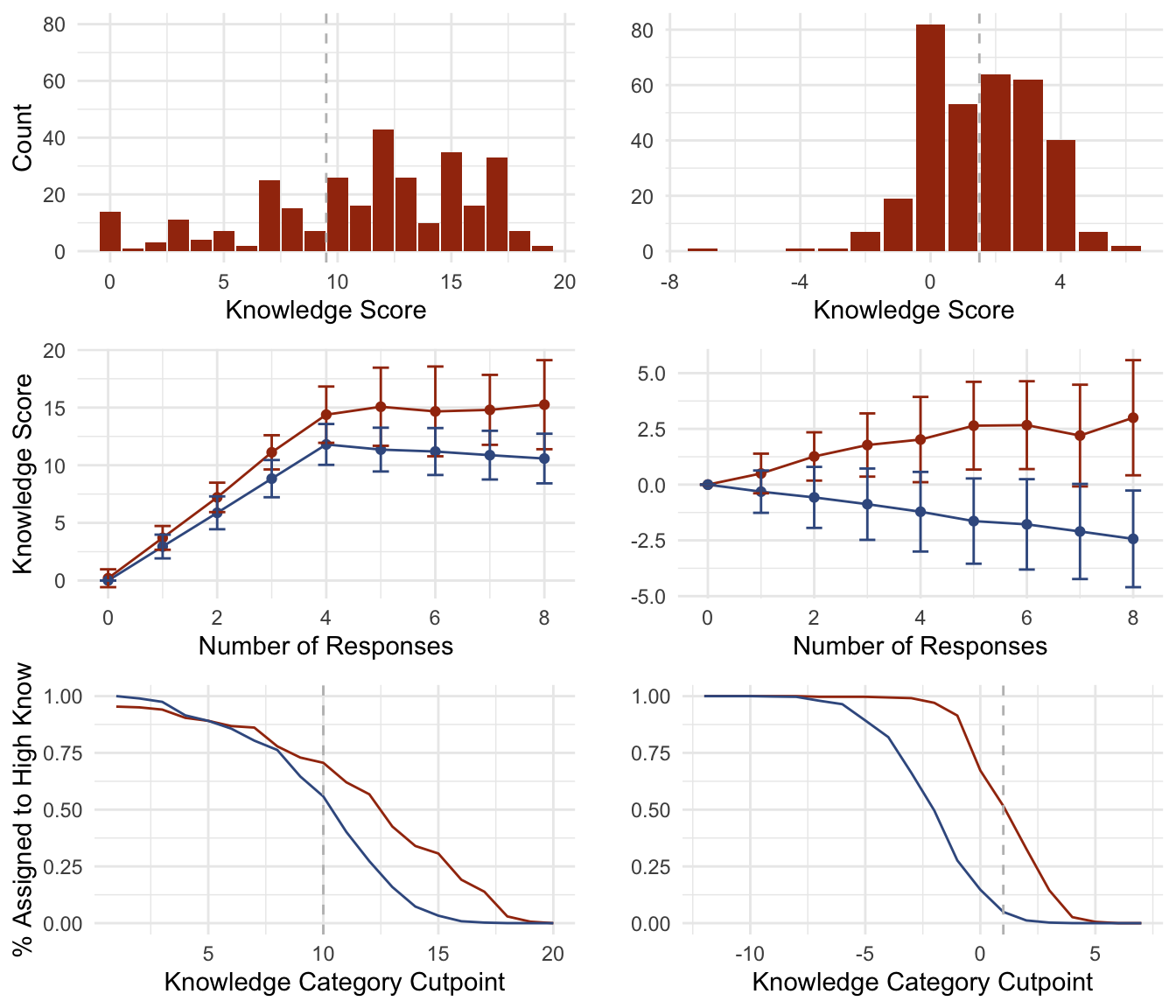
The last row shows the proportion of observed (red) and simulated (blue) respondents who would been assigned to the “high knowledge” category over different possible bin cutpoints. The left plot shows there is little difference between the proportion of observed and simulated data at and below the cutpoint used in the 1994 article (10). At this cutoff point, more than 50% of pseudo-random guessers would have been assigned to the high knowledge bin. The final analysis in the 1994 study may therefore have compared the voting behaviors of lucky pseudo-random guessers against unlucky pseudo-random guessers. On the right, there is a clear and wide gap between observed and simulated data at all cutoff values. Table 4 below gives results based on a cutpoint equal to 2: at this cutpoint, half of the observed data is in the high knowledge category while there is only a 5% chance that a pseudo-random guesser would erroneously be assigned to this bin.
Direct Scale Agreement
Figure 4-A (left) shows the bivariate relationship between the original and proposed knowledge scales. A small jitter was applied to the plot to illustrate the density of the red “true positives”: observations that were assigned to the high knowledge category under both knowledge scale constructions. Black observations indicate “true negatives”: observations that are binned as low knowledge in either case. Blue observations are observations that were binned as high knowledge in the original construction and low in the new (~20% of observations) while orange indicates the converse (< 10% of observations).
Fig. 4: Scatter Plot and “Confusion Matrix”
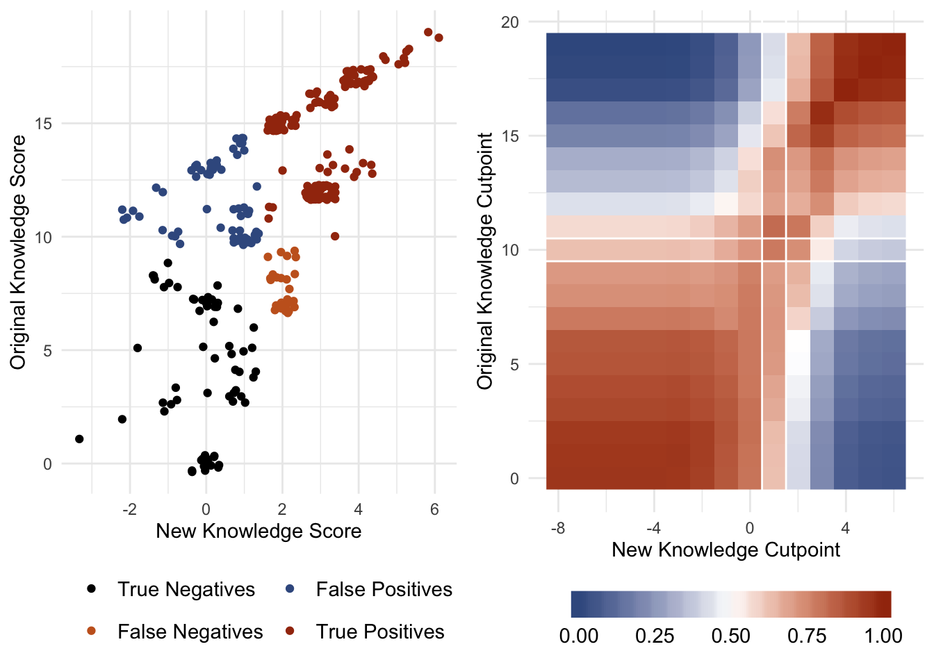
Figure 4-A (left) plots the bivariate relationship between the new knowledge score (x-axis) and the original (y-axis). Figure 4-B (right) is a heatmap illustrating the proportion of true positive and true negative agreement across all possible cutpoint values in both scales; blue colors indicate lower agreement (min 0%) and red values indicate higher agreement (max 100%). The white lines in Figure 4-B highlight the cell used in creating the extension of Table 4 below: this cell contains the maximum proportion of binning agreement between the two scales while keeping the original cutpoint constant.
This figure illustrates the level of agreement between the two scales regarding which respondent belongs in which knowledge bin (70%). Figure 4-B explores this relationship at all possible combinations of cutpoints for both the original and new knowledge scales and plots the proportion of true negatives and positives across these combinations. The white lines show the cutpoints used to create the arbitrary knowledge bins, and construct Table 4 below. For the initial analysis in Table 4, a cutpoint of 2 was selected in the new knowledge setup as it has the greatest level of agreement with the original knowledge score when holding the original cutpoint constant (and thereby presumably present the results most similar to the original as possible while also correcting for the problematic knowledge scale). Table 5 explores how the results might have been presented had a higher cutpoint been used; namely, the cutpoints at which the level of agreement (original knowledge cutpoint = 16 and the new knowledge cutpoint = 3).
Replication and Extension of Lupia’s Table 4
Lupia relies heavily on Table 4 of the original article to illustrate his central point: low-information electors behave similarly to high-information voters when they hold accurate information shortcuts (in this case, knowledge of the insurance industry’s position on each proposition). This table has been replicated and modified in order to present its information more effiicently. The modification simply presents the differential between a group’s mean voting behavior and the high-knowledge group’s mean voting behavior. This way, patterns of similarity and dissimilarity are more readily accessible. The table is extended to include information omitted from the original analysis, namely the voting behavior of the high-information/poor-shortcut group. It is also extended to illustrate what the results would have been had Lupia used the knowledge scale as it was constructed here.
Table 4: Replication and Extension of Table 4
|
group
|
prop100
|
prop101
|
prop103
|
prop104
|
prop106
|
|
Replication
|
|
Low K w/ Shortcut
|
0.5
|
2.43
|
0.58
|
0
|
1.97
|
|
High K w/o Shortcut
|
19.97
|
5.58
|
12.85
|
8.66
|
26.44
|
|
Low K w/o Shortcut
|
27.83
|
7.69
|
49.42
|
17.81
|
34.75
|
|
Extension: Cutpoint = 2
|
|
Low K w/ Shortcut
|
8.43
|
3.19
|
3.36
|
6.41
|
8.38
|
|
High K w/o Shortcut
|
22.07
|
8.04
|
9.69
|
10.23
|
29.17
|
|
Low K w/o Shortcut
|
31.45
|
11.09
|
35.77
|
17.81
|
35.24
|
The astute reader has likely noticed that Table 4 is only the second table in this article. Since it was a replication of Table 4 in Lupia (1994), I did not want to be the cause of any (additional) undue confusion by referring to this as Table 2, which is itself referring to Table 4.
Lupia’s central argument is that voters in the “Low-Knowledge w/ Shortcut” group behave as if they were fully-informed by voting similarly to voters assigned to the group with high knowledge and accurate shortcuts. The first two rows in the replication table show support for the central argument in a dramatic fashion. The differential in the first row is near zero, while being consistently and significantly smaller than the other rows.
It should be readily apparent that the general pattern of findings in the original study hold when using the new knowldge score. However, the differentials in the first row are quite a bit larger in the extension than in the replication, and not as dramatically distinct from the differentials in other rows. By constructing a knowledge scale that is agnostic toward the observational equivalence problem and punishes respondents for random guessing, Table 4 presents a more honest interpretation of Lupia’s original data. Luckily for the more idealistic Democratic Theorists, the patterns in the data tell much the same story as the original presentation: low-knowledge electors behave like high-knowledge electors when they have accurate information shortcuts, the only difference being that the patterns are not quite so dramatic as originally presented.
Table 5: Extension of Table 4 at Higher Knowledge Standard
|
group
|
prop100
|
prop101
|
prop103
|
prop104
|
prop106
|
|
Extension: Cutpoint = 3
|
|
Low K w/ Shortcut
|
5.76
|
5.37
|
10.48
|
1.52
|
4.77
|
|
High K w/o Shortcut
|
21.65
|
7.3
|
6.98
|
5.77
|
28.59
|
|
Low K w/o Shortcut
|
29.74
|
13.83
|
29.51
|
11.64
|
32.95
|
It should also be mentioned here that these results are only somewhat resilient to alternative group cutpoints. On average, the general pattern holds for all group cutpoints; however, the pattern becomes more variable as the information cutpoint is increased. For example, there are instances under high knowledge cutpoints (e.g. new knowledge of 3 or higher, as in Table 5) in which the high-information groups begin to look most like one another regardless of information shortcuts, and likewise for low-information groups. That said, I am reluctant to give any weight to differential patterns at cutpoints of four or higher, as the number of observations decreases dramatically after a cutpoint at three. If one of Lupia’s primary motivations was to save the Democracy from realists and rationalists, it is important that we take our thumb off the scale and present the data as honestly as possible; by presenting all of the data, the reader can decide for herself the appropriate cutpoint to compare high and low knowledge groups. Otherwise, the presentation of the results may appear to be an attempt at manipulation.
Discussion
Here I have taken Lupia’s original data and made slight modifications to the construction of a key variable in order to present a more honest - and hopefully persuadable - story. This short article addresses the problem of observational equivalence plaguing the original knowledge construction to create a more valid and stable measure of knowledge. Correcting for this issue, the findings are consistent with the 1994 article, though not to such an extreme degree as originally presented. Low information electors do behave similarly to high-information electors when they hold accurate information shortcuts.
However, this post addresses only one of two major issues with the original article: the issue left undiscussed is whether the knowledge scale can be argued to measure the kind of knowledge that is important to electors and Democratic Theorists. In researching voter competence, scholars sometimes forget that they too use information shortcuts and that they are likely low-information voters. I had colleagues admit as much after the 2016 election, when they voted on various California referenda but were not sure what they were (and these were political scientists, mind you). We political scientists are not experts on every political issue; very few of us can claim to be experts on more than one issue (if that). As a result, we often fool ourselves into believing that some types of information should matter to electors or to our ideological opponents.
Given our own limitations, a good starting point for researchers may be to ask ourselves how we come to ballot-box decisions despite our relative lack of information. Is it sufficient to know which proposition establishes a certain policy? Shouldn’t we have some idea of the implications of those policies? Who benefits from the policies? What are the immediate and person policy implications? What about community-wide, or statewide implications to the quality of life of the state’s residents or the economic performance of its industries? By measuring merely superficial knowledge of each proposition, Lupia’s 1994 article may be doing nothing more than comparing low-knowledge electors with accurate shortcuts to even less-knowledgable electors with accurate shortcuts. In which case, the similarities between these groups should not be at all surprising.
On the subject of the sort of knowledge that matters, consider Table 2 in the 1994 article, which presents the logistic regression coefficients predicting vote choice over levels of knowledge and shorcut awareness:
Table 6: Truncated Logistic Coefficients
|
|
prop100
|
prop101
|
prop103
|
prop104
|
prop106
|
|
Knowledge
|
0.05
|
-0.09*
|
0.22**
|
-0.06
|
-0.07
|
|
Insurance Sh.
|
2.57**
|
-1.89
|
3.35**
|
-1.15
|
-2.28**
|
|
Insurance Sh. X Knowledge
|
-0.10
|
0.41
|
-0.20**
|
0.04
|
0.02
|
|
Lawyer Sh.
|
-2.42**
|
|
|
|
-1.25
|
|
Lawyer Sh. X Knowledge
|
0.15*
|
|
|
|
0.04
|
First, these logistic models are hardly any more predictive than random guessing, so the models clearly suffer from some unmeasured determinant of voting behavior. That said, take the results with a grain of salt. Second, notice the direction of the coefficients: the variables that do all of the predictive legwork in these models are the positions of the insurance industry and trial lawyers. Notice though that in each case the coefficient is in the opposite direction of the interest group’s preference. This suggests that while these propositions did not clearly align with the two major political parties, there appeared to be a populist, anti-insurance industry sentiment driving voting behaviors.
Might the high-knowledge electors and low-knowledge electors have been united in their animosity toward the insurance industry? If yes, then results work in opposition to Lupia’s interpretation of the data. To lean in fully on playing the devil’s advocate: let’s take the knowledge scale to be an appropriate measure of the rationalists’ ideal. We see that the interaction between shortcuts and knowledge tempers the effects of the shortcuts (or the passions) as the interaction coefficients work in the opposite direction of shortcut coefficients. Returning to the fears described in Federalist 49, this interpretation suggests that information shortcuts have not enabled low-knowledge electors to behave as if they were fully-informed, rather they have led high-knowledge electors to vote according to their passions, like low-information voters. Do information shortcuts actually interfere with logical decision-making?
No. Instead, the point above speaks volumes to the public’s ability to overcome a complex political environment of misinformation. The insurance industry dominated campaign spending in this election with ads strategically dissembling the source of their spending. The insurance industry funneled campaign spending through political organizations that appeared to be pro-consumer (Lupia 1994:66). That electors were able to identify the propositions favored by the insurance industry in spite of the insurance industry’s efforts at obfuscation is a feat in itself. In this light, it is more appropriate to view the shortcut variable as the standard of informed voting in elections; it concerns who gets what, and it identifies the voters who are not susceptible to nefarious practices of deception. This point undermines Lupia’s central argument, however. If we return to Tables 4 and 5 and treat “knowledge” as superficial information and “shortcuts” as the standard of informed voting, we see that the low-informed (those without shortcuts) vote in a drastically dissimilar fashion to the highly-informed.
In futures posts, I will expand on how other scholars since 1994 have attempted to address this question, and explain how it is relevant to modern Amerian Politics. For now, I will let this issue stand, as this post is merely an investigation into the findings of this seminal article on the 25th year anniversary since its publishing limited to the data and techniques available to the author at that time. I hope to have shown the importance of honest story-telling with data: seemingly trivial choices regarding the construction of scales can have meaningful impacts on how data is presented, and the interpretation of those scales can have drastic impacts on schools of political thought. This post is also a warning to graduate students and scholars everywhere: be wary of scales and the thumbs they may be under.